Menu
Duke-NUS Medical School
As organisations grow and flourish, their brand architecture starts to take on a life of its own: new programmes, centres and initiatives start to feel the need to carve out distinctive identities of their own. This is where a coherent visual communications system helps to establish and communicate the hierarchy within the brand architecture.

Strengthening Reputation
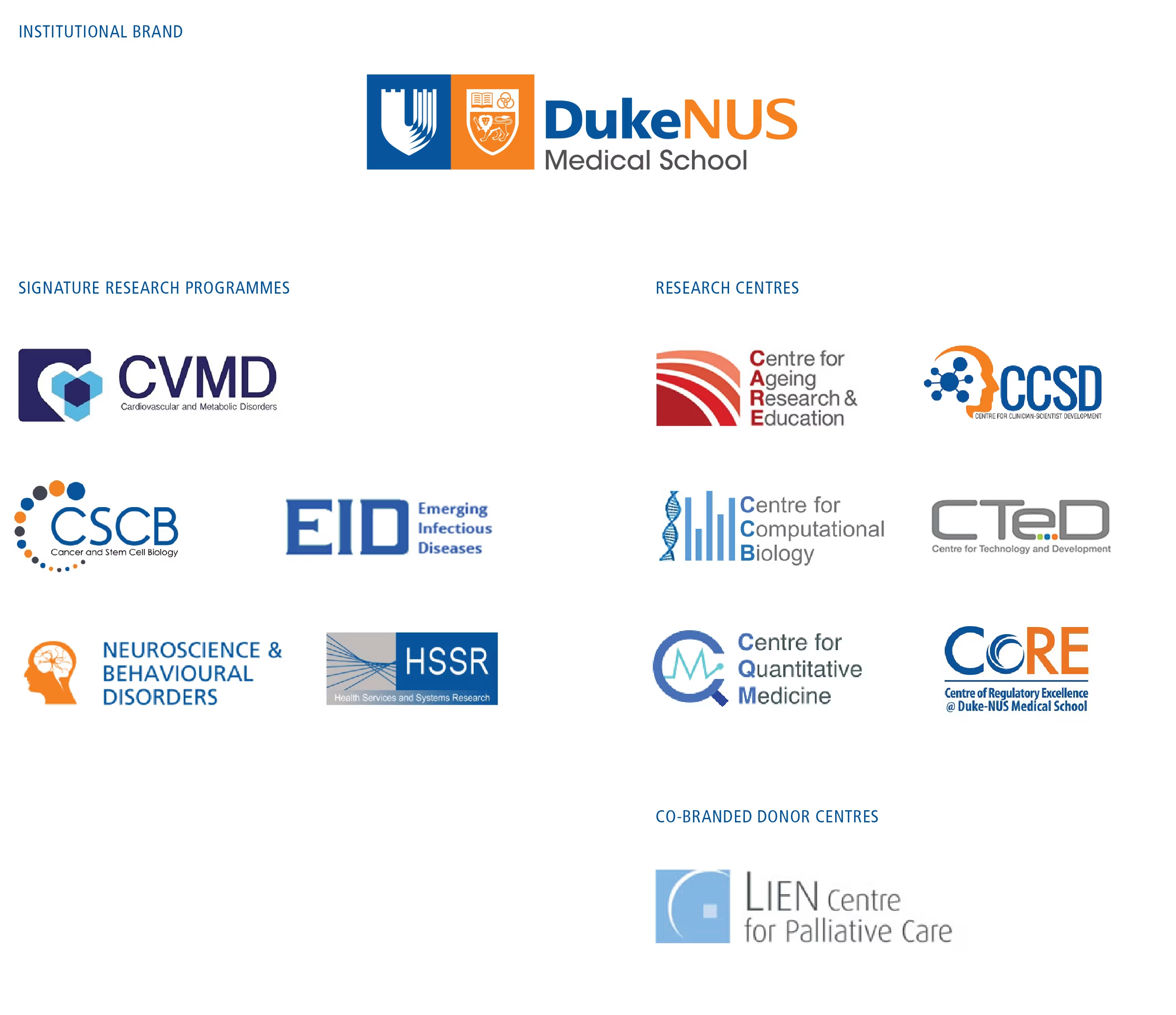
Duke-NUS Medical School was faced with the dilemma of multiple sub-brands, each with a distinctive identity of their own, fragmenting and diluting the reputation of the institution.
As Singapore’s only graduate medical school with a relatively small cohort, there was also a danger of the school being perceived to have a low impact in nurturing future-ready clinicians and on the healthcare system if the distinction of a Duke-NUS offering was not made clear.

Resolving Complexity
Gaining alignment in issues pertaining to brand architecture is always a sensitive issue within organisations. Through a series of stakeholder interviews and iterative discussions, Activiste demonstrated how with a coherent and vibrant visual communications system supporting the brand architecture, could help internal and external parties better navigate its offerings and appreciate the collective value that Duke-NUS brings to healthcare research, education and clinical practice in Singapore.
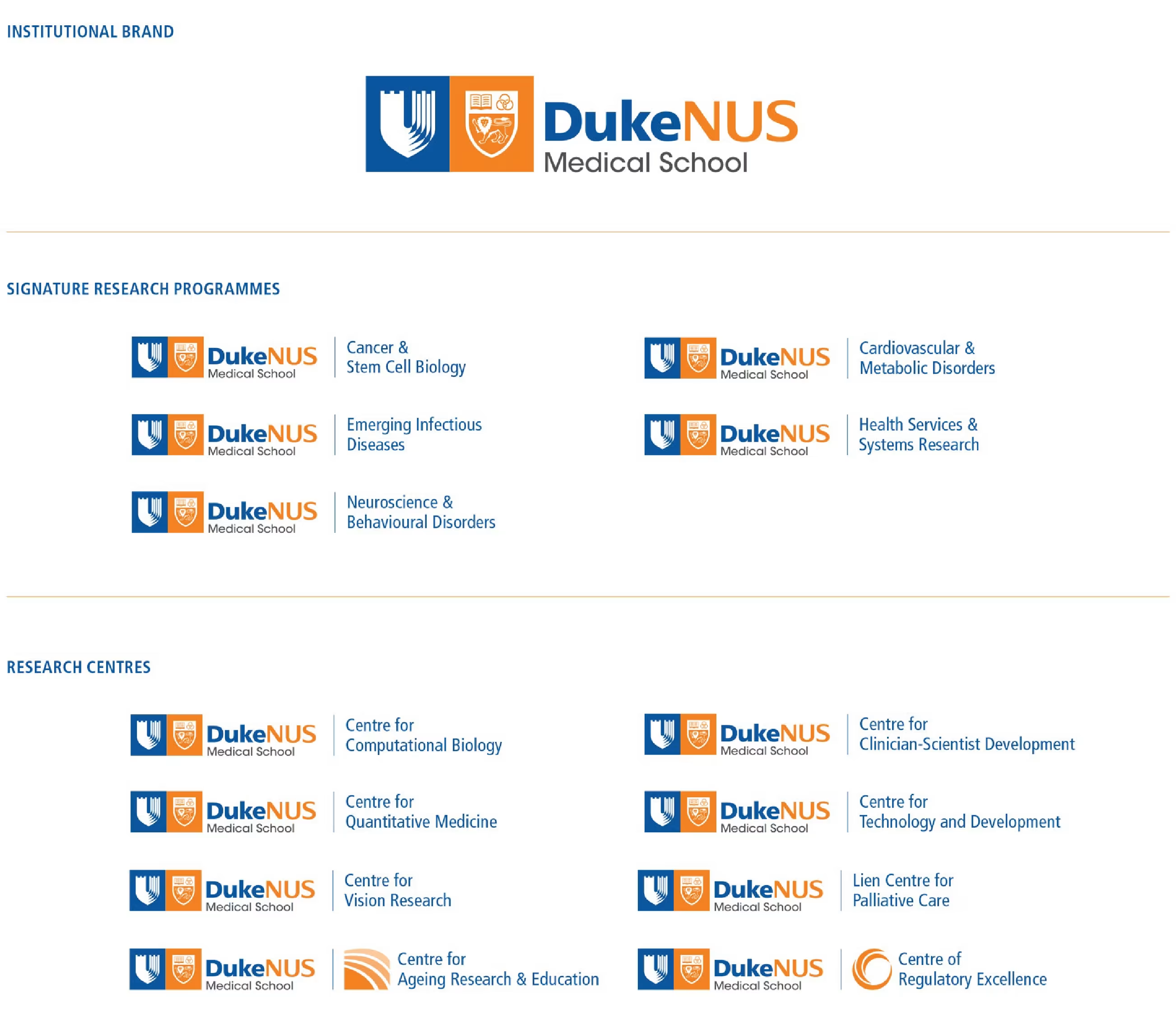
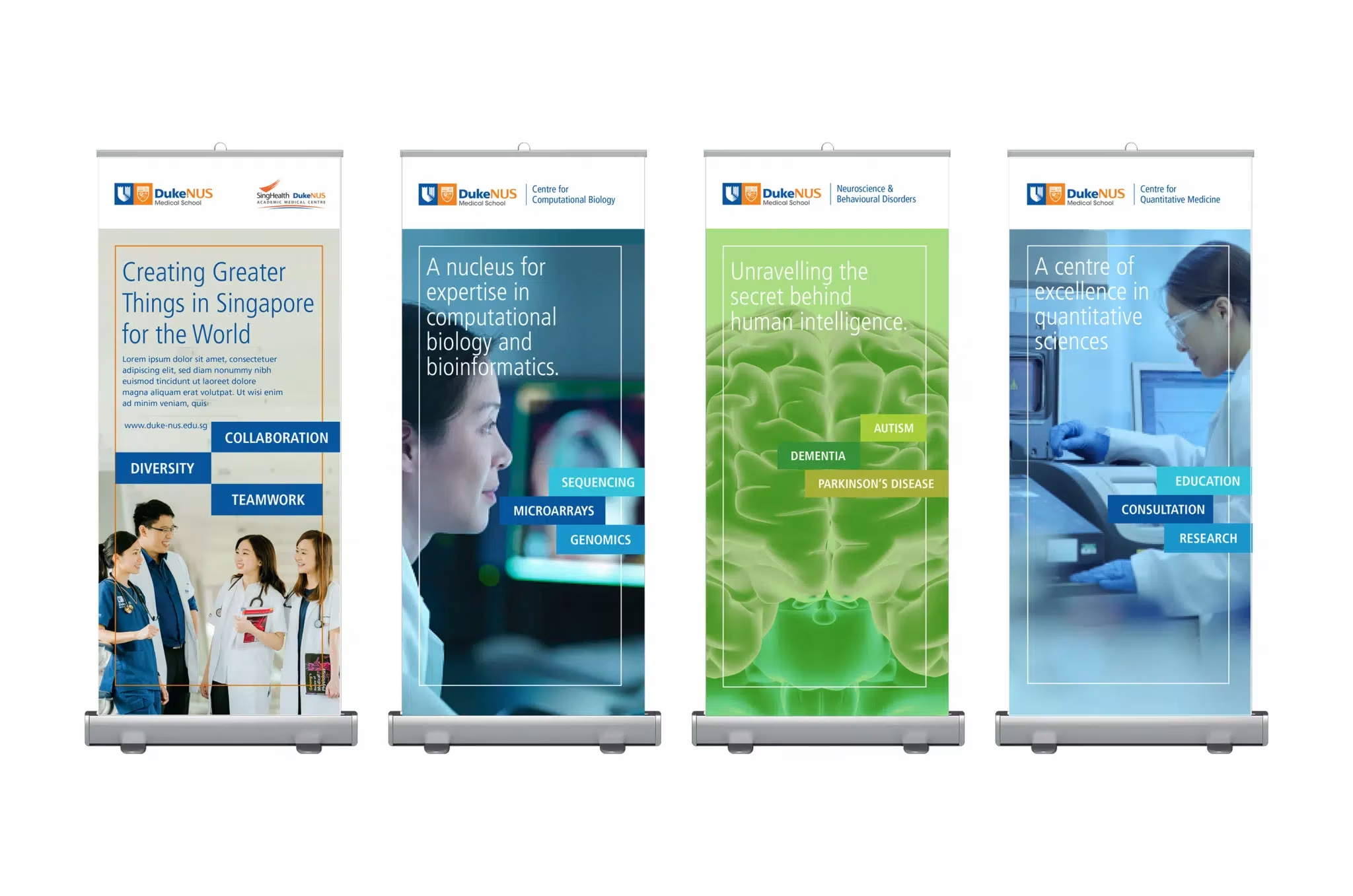
Strategic programmes which do not belong to an SRP or centre will sit under the institutional brand and do not need a distinctive identity in order to be noticed.
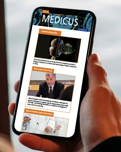
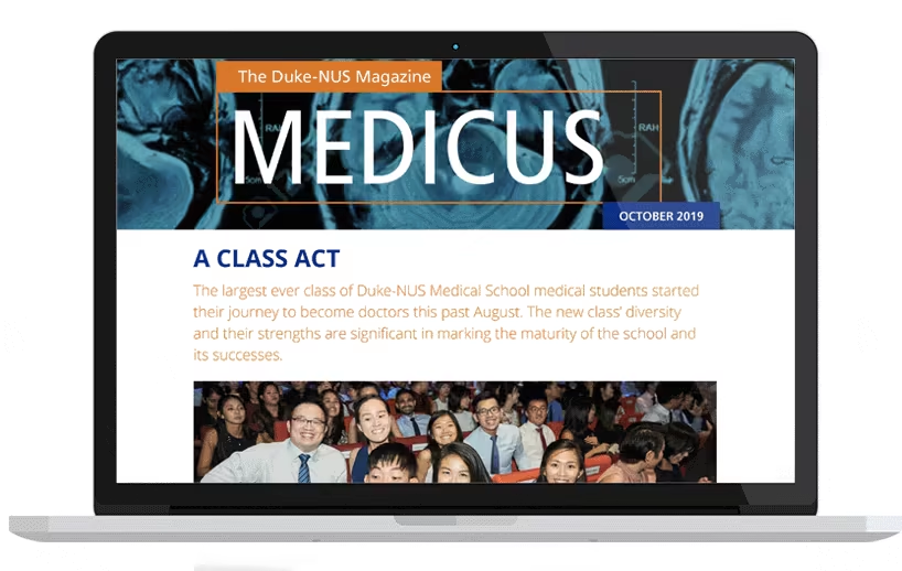
Visual system principles for making strategic programmes easily identifiable as part of the Duke-NUS institutional brand.
Visual system principles for making strategic programmes easily identifiable as part of the Duke-NUS institutional brand.
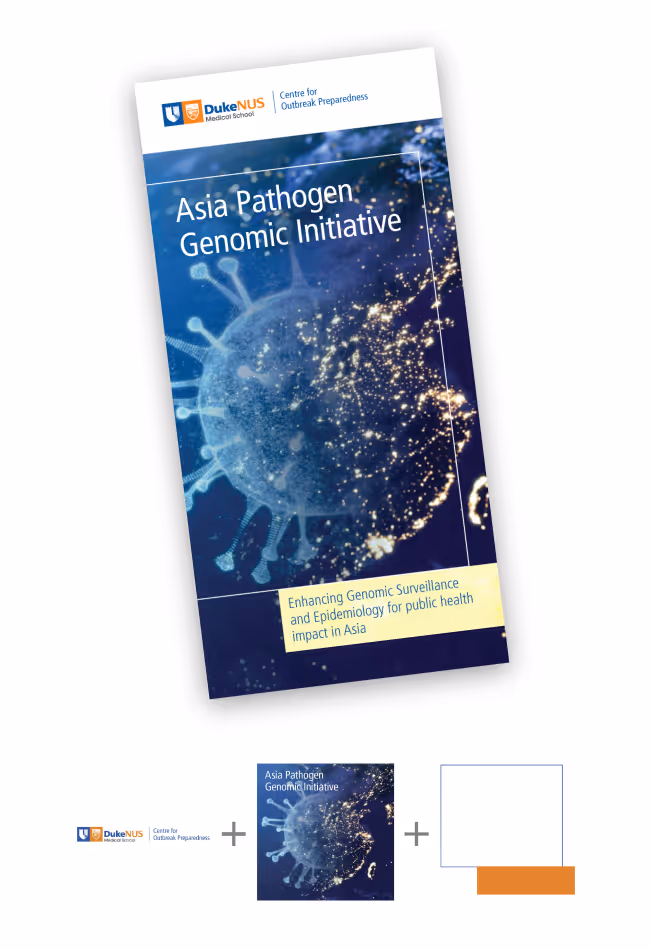
Key graphic elements within the overarching visual system enhance institutional brand recognition whilst highlighting significant initiatives.
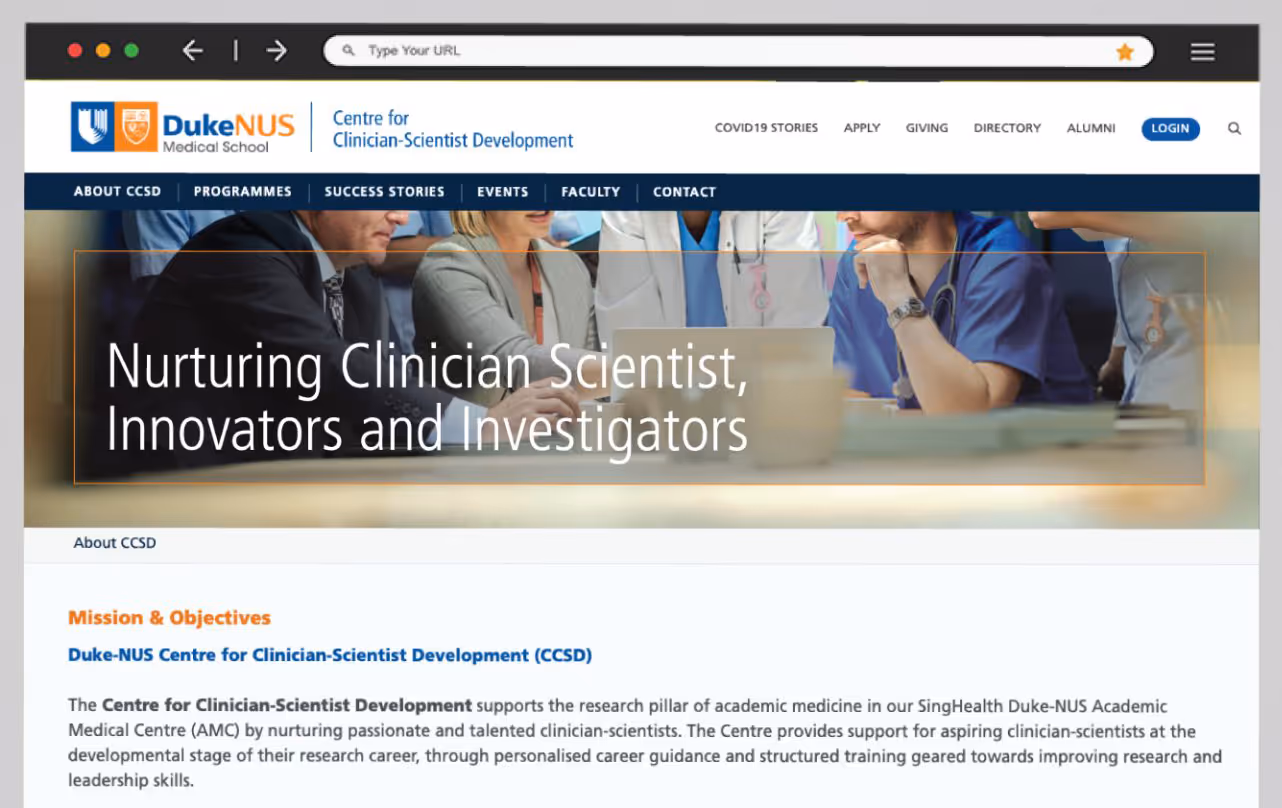
Highlighting key goals of the centre in web banners for the centre website is an alternative way to communication a change in strategic direction.
Highlighting the strategic focus or direction in hero banner.

Key graphic elements within the overarching visual system enhance institutional brand recognition whilst highlighting significant initiatives.
“Activiste’s strategic insights have been helpful in the enhanced definition of our brand, granting it a clear, consistent and integrated identity.“
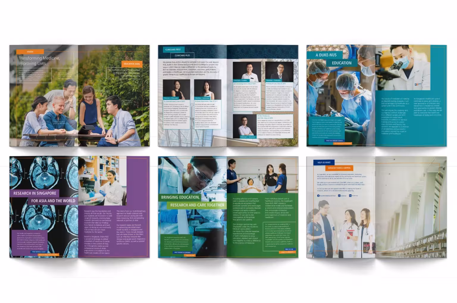
Greater Things Happen Here
Brand architecture often manifests within a recognizable visual system, which plays a crucial role in communicating the relationships between a parent brand and its sub-brands or product lines. This visual system is more than just logos and color schemes; it is an integral part of how brand architecture is perceived and understood by consumers, stakeholders, and employees.
As a medical school focused on building physician scientists of the future who can tackle and solve many of the pressing problems in healthcare, Duke-NUS is finally getting the recognition is so richly deserves.
For Duke-NUS, their brand architecture is manifested within a recognisable visual system, which plays a crucial role in communicating the relationships between a parent brand and its sub-brands or product lines. This visual system is more than just logos and color schemes; it is an integral part of how brand architecture is perceived and understood by different stakeholders, and employees.


©Activiste Pte Ltd. 2026